Colour
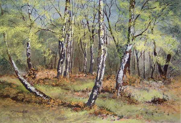 'Birch Woods' Mixed Media
The first thing I would like to emphasise is that even when you first begin painting it is best to use the highest quality materials and colours you can afford. It is a big mistake to try to use poor quality materials, which are incapable of producing quality results. It will only lead to disappointment if you do.
Having said that I would next suggest that starting out with a minimum number of different colours is to be recommended. My choice for paint colours would be Ultramarine Blue, Cerulean Blue, Yellow Ochre, Lemon Yellow, Alizarin Crimson, Cadmium Red, Burnt Sienna and Burnt Umber for a Transparent Watercolour selection. For Acrylics or Oils I would add a tube of Zinc White and a tube of Black. Burnt Sienna and Burnt Umber are added to the list as mixed with Ultramarine Blue each produce a range of magnificent greys which can be used for shadows and much else.
This selection of basic colours will allow you to produce pretty nearly any shade of any colour you care to use. Having acquired your selection of colours I would next recommend that you select pairs of colours and a large sheet of good paper for each pair. Then using a large flat brush, say a one inch sable, dip each corner of the brush separately into a strong mix of each single colour and then apply the brush to the paper so as to allow the paints to mix and blend as you move the brush around. Observe the effects you obtain – make notes on the paper as you proceed.
Make different strength mixes of the colours, keeping note of the different proportions of each colour so that bit by bit you learn what mixture produces what sub colour. In this way, and by using all possible pairs of colour, you will learn how to produce any colour you wish to use.
When it comes to producing a painting the choice of colours to be used are personal. Each artist will make his or her own choices so that their preferences will become part of their individual style. It may be that you will choose to use the colours you see in your subject, just as you see them. Or you may decide that to obtain the effect and feeling you want for your subject you will alter the colours, perhaps cool them down by shifting them towards the blue or warm them by shifting them towards red. Or possibly some other colour shift to make the subject appear the way you feel it should be.
When you are thoroughly familiar with the capabilities of the basic colour selection you might feel inclined to add other colours, say an additional yellow – Cadmium Yellow for instance. Perhaps a Violet for a particular painting which needs a sharp clear violet – try Windsor Violet. The choices are yours. Experiment and gradually acquire a few more colours and see what mixes they will produce when used with your existing colours. Then practise some more.
That’s it for today. The next article will appear on Wednesday.
Till then, take care and keep painting.
Tony
posted by Tony Attwood at 10:16 AM
![]()
![]()

0 Comments:
Post a Comment
<< Home