Tuesday, August 29, 2006

Negative Space and Counterchange

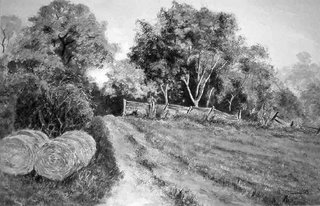
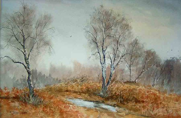
'Who Goes There?' Acrylic Watercolour

I have touched on counterchange, dark against light and light against dark, in one of my previous articles but what is this negative space thing?

Quite simple really – it is the space around an object or the space which an object surrounds.
Try this little experiment, it can be fun. Start with a plain white sheet of paper and paint just what you can see through the handle of a mug. Then paint everything you can see around the mug itself so that you are left with a white space on the paper which is the shape of the mug. You have defined this shape not by painting the shape itself but by painting everything around that shape. Now you can put some detail in the shape itself and there you have it.

An object or a set of objects can be defined simply by drawing or painting the negative spaces, which enclose or are contained within the object's boundaries.

All this sounds very complicated but the painting shown above was chosen for today’s illustration because the gate was primarily developed in the painting by drawing the spaces between the railings. This together with counterchange defined the gate precisely before any of the details of the gate itself were painted.

The Stoat obviously wasn’t there when the gate was painted but it was a frequent visitor to the garden and it seemed appropriate to include it.

An understanding of negative space and counterchange is very useful as these powerful concepts can lead to the creation of exciting and powerful pictures. It is well worth the effort to think about and experiment with these techniques.

That's it for today. Until next time take care and keep practising.

Tony

Friday, August 25, 2006

Painting a Series - Part 3

'Storm Light, Gower' Acrylic

Above is the third and so far the final version of Caswell Bay, Gower. I have called this painting ‘Storm Light, Gower’.

This version is painted entirely in Acrylic paints and once again on Saunders Waterford 140lb paper. This time, however, the paper has already been used once before.

Not all paintings come up to standard, I so if I paint a watercolour, for example, which doesn’t quite come off I don't regard the painting as a failure just a step in the learning process! The paper isn’t wasted. I simply paint a layer of white acrylic gesso over everything and use this support to paint something in acrylic.

The version of Caswell Bay above is just such a painting, an acrylic painting done on top of a previous painting I wasn’t satisfied with. Here the acrylic paint has been used straight from the tube without much, if any, dilution.

Once again I have tried for an impression of space and made much of the sky. I was trying to produce a picture which emphasises the effects of the prevailing weather. It was windy and there were heavy showers at times.

When I had completed this painting I wasn’t too sure about it so I framed it and it is hanging in my downstairs hall. The longer I live with it the more I like it. It's a bit like looking at the flames in the fire; the more you look the more you see. So it is with this painting and I am still learning from it.

So that is it, my series of three paintings of Caswell Bay, Gower.

Until next week, take care and perhaps try painting your series.

Tony

Wednesday, August 23, 2006

Painting a Series Part 2

'Evening Light, Gower' Mixed Media

Continuing from yesterday the illustration above is Caswell Bay, Gower version 2. I have called the painting 'Evening Light. Gower' but it is based upon exactly the same reference material as was used for version 1.

I used Liquitex, Rembrandt and Winsor & Newton Acrylic paints together with Derwent pastels. Also used were acrylic matt medium and a small amount of white Gouache. Once again the paper support is Saunders Waterford 140lb Not.

The interpretation is somewhat looser in this version. I have not conformed exactly to the shapes of the cliffs and I have pushed them further back. The reason for this is because I wanted to accentuate the space together with the lighting, which prevailed during my visit to this bay.

I first went to The Gower in 1955 as a student of Geology. Since that time I have wanted to return to photograph and paint the sea, cliffs and beaches of this wonderful place.

On Friday i will present my third and so far final version of Caswell Bay.

Until then, take care and keep up with the experimentation.

Tony

Tuesday, August 22, 2006

Painting a Series

'Caswell Bay, Gower' Artists Watercolour


It can be fun, interesting and informative to paint a series of pictures from the same source material. This week I am going to show you three paintings I made from sketches and photographs I took during a visit to Gower in South Wales.

The first version is pretty much as the scene was during my visit. The wind blew strongly from the west. The evening light was coloured by the approaching stormy skies and off and on showers threatened. The conditions made sketching difficult but not impossible, so several small sketches were made with copious notes regarding local colour and so on. Finally two or three photographs were taken for reference and a general record of the visit. At this time I was using an SLR with film but a few months later i changed allegiance and now shoot my photographs entirely with a digital camera.

Back in the studio the first version of Caswell Bay, Gower was made in Artists Watercolour. The result is shown above.

The painting was completed in about two hours using traditional methods. First a drawing was made on the stretched paper. The paper used here is Saunders Waterford 140lb. Not and the paints are Winsor & Newton Artists Watercolour.

The painting followed my usual method with the sky being painted first and allowed to dry thoroughly. The lower part of the picture was completed using first the lighter toned washes and then developing the painting with stronger mixes until the final stage, when a few stronger touches were added to strengthen forms. The overall colour scheme was kept simple using only a few colours from my basic selection. ( I listed them in the article on colour posted on 14th August)

On Wednesday I will show you the next version I painted.

Till the, take care and keep practising.

Tony

P.S. I received an email from Clive saying he had been unable to post a comment. He said when he tried he obtained a form requesting a friend's email address. I think he must have clicked on the envelope symbol which allows the whole page to be emailed to a friend.

To post a 'Comment' click on the word comment. You will then get a box in which you can type your message.

I hope this helps any of you who have been having problems with this. Now you have no excuses.


Monday, August 21, 2006

Appologies

I have tried several times today to post my latest article but for some reason I am unable to upload the illustration. I shall try again tomorrow.

Once again my appologies for the delay.

Take care.

Tony

Friday, August 18, 2006

Counterchange

'Three Cliffs Bay Gower' Acrylic Watercolour


Counterchange is the positioning of dark colours against light and light colours against dark.

This technique emphasises edges without them having to be ‘drawn’. If an edge is important to your painting it is not necessary to draw a line to differentiate it. Even if in your subject adjacent shapes are a different colour but the same tone, the edge between them may be defined simply by making the darker of the two objects darker still. Alternatively the lighter may be made lighter still with the same effect. Some may be tempted to draw a line – don’t, this just gives away the amateur.

Today’s illustration shows counterchange in many places. As an exercise see how many edges you can find that have been treated in this way.

When you are out in the town or the countryside look for examples where counterchange occurs naturally. Also look for opportunities to use counterchange in your own work. These need to be planned or the chances are they will not work effectively. The better the planning, the better the result.

That’s it for today. The next article will be posted on Monday. Have a good weekend and keep painting.

Take care.

Tony

P.S. This is the fifteenth article posted on this blog. I know there are visitors to this site but you seem to be shy. How about a bit of feedback. Let me know what you think.

Wednesday, August 16, 2006

Clouds, Perspective and Photographs

Tranquility Transparent Watercolour

You all know what perspective is. It is the way objects in the distant landscape appear to be smaller because they are further away than closer objects. It is the way railway lines appear to converge as they disappear into the distance. It is also the way in which colours appear bluer the further away they are.

So what has this to do with clouds?

For a landscape painter, whatever your medium, (oils, acrylic, transparent watercolour or pastel) it is very important. Clouds are objects in the landscape and their distance away from you vary. Perspective applies to them just as much as if they were hard concrete objects.
Go outside and look at a cloudy sky. Those clouds high in the sky, almost above your head, are large and show a great deal of separation. As you look lower down, at perhaps a 45-degree angle, the clouds tend to appear smaller and more closely packed.

Lowering your gaze again you will see that towards the horizon clouds tend to become very tightly packed together and much smaller. and The colours also soften.

If you take photographs of clouds and sky patterns for reference as I do you must be very careful when you come to use them, especially if the camera was angled upward when the photograph was taken.

If such a photograph were to be used directly the perspective would be wrong. It would need to be adjusted towards the lower sky levels to bring the perspective back into line.

When taking photographs of the sky for reference it is helpful if a note is made of the direction in which the camera is pointing, the time of day (digital cameras do this automatically) and the general weather conditions (rain, wind etc.).

That’s it. The next article will be posted on Friday.

Till then, take care and keep on painting.

Tony

P.S. I realised this morning that a couple of postings ago I used a painting I had already used once before. Whoops! I shall try not to let it happen again.


Monday, August 14, 2006

Colour

'Birch Woods' Mixed Media

The first thing I would like to emphasise is that even when you first begin painting it is best to use the highest quality materials and colours you can afford. It is a big mistake to try to use poor quality materials, which are incapable of producing quality results. It will only lead to disappointment if you do.

Having said that I would next suggest that starting out with a minimum number of different colours is to be recommended. My choice for paint colours would be Ultramarine Blue, Cerulean Blue, Yellow Ochre, Lemon Yellow, Alizarin Crimson, Cadmium Red, Burnt Sienna and Burnt Umber for a Transparent Watercolour selection. For Acrylics or Oils I would add a tube of Zinc White and a tube of Black. Burnt Sienna and Burnt Umber are added to the list as mixed with Ultramarine Blue each produce a range of magnificent greys which can be used for shadows and much else.

This selection of basic colours will allow you to produce pretty nearly any shade of any colour you care to use. Having acquired your selection of colours I would next recommend that you select pairs of colours and a large sheet of good paper for each pair. Then using a large flat brush, say a one inch sable, dip each corner of the brush separately into a strong mix of each single colour and then apply the brush to the paper so as to allow the paints to mix and blend as you move the brush around. Observe the effects you obtain – make notes on the paper as you proceed.

Make different strength mixes of the colours, keeping note of the different proportions of each colour so that bit by bit you learn what mixture produces what sub colour. In this way, and by using all possible pairs of colour, you will learn how to produce any colour you wish to use.

When it comes to producing a painting the choice of colours to be used are personal. Each artist will make his or her own choices so that their preferences will become part of their individual style. It may be that you will choose to use the colours you see in your subject, just as you see them. Or you may decide that to obtain the effect and feeling you want for your subject you will alter the colours, perhaps cool them down by shifting them towards the blue or warm them by shifting them towards red. Or possibly some other colour shift to make the subject appear the way you feel it should be.

When you are thoroughly familiar with the capabilities of the basic colour selection you might feel inclined to add other colours, say an additional yellow – Cadmium Yellow for instance. Perhaps a Violet for a particular painting which needs a sharp clear violet – try Windsor Violet. The choices are yours. Experiment and gradually acquire a few more colours and see what mixes they will produce when used with your existing colours. Then practise some more.
That’s it for today. The next article will appear on Wednesday.

Till then, take care and keep painting.

Tony

Thursday, August 10, 2006

Edges and How to Treat Them

'Spring Birches' Acrylic Watercolour

The treatment of the edges of objects within a painting is extremely important. The quality of the edges defining the shapes of the various objects will have a substantial effect on the final impact the picture makes with the viewer.

Not all edges are equal in that some are hard and firm while others are softer and less substantial. Often adjacent objects will have component parts that are tonally similar, and so the common edges will tend to merge together giving what is referred to as ‘lost and found’ edges.
Some objects will have completely soft edges, clouds for example. But even some cloud forms will have hard edges which show clean and hard against the blue of the sky.

Before you start to paint, perhaps during the time you are studying the subject to determine the tonal values within it, pay attention to how the edges of objects appear.

When painting with any of the water based media on paper the wetness or dryness of the support will determine the quality and definition of an edge. If the support is bone dry a hard edge will form but as the support becomes more and more damp so the edges will become softer as the paint diffuses across the surface.

If you wish to achieve a mainly hard edge but with some softer sections this may be done simply by dampening the paper just in those places where you want the soft edges to occur. Alternatively, lifting some of the still damp paint with a damp brush may soften a hard edge. Some practice with both of these techniques is required but they are easily mastered so give it a try.

That’s it for today. I have decided to give myself a day off tomorrow and have a long weekend out and about with the sketchpad and camera. The next article, on colour, will be on Monday.

Have a good weekend and paint a lot.

All the best.

Tony

Wednesday, August 09, 2006

Tonal Values

'Nynehead Way' Acrylic Watercolour

Beginning artists are frequently confused by the term ‘tonal value’. What does this mean?

The tonal value ranges from white or the lightest light colour to black or the darkest dark colour. All colours have a tonal value as well as a colour and that tonal value will change, as the colour is diluted say with water in the case of transparent watercolour or acrylic.

The picture I chose as the illustration today has an almost complete range of tones. The lightest tone is in the sky area showing through the trees above the gateway. The darkest tone is in the hedge to the left of the picture. The intermediate tones or mid tones occur throughout the picture.

To make this idea of tones and tonal value clear I have converted the picture to a greyscale image.


If you place the lightest tone in your picture adjacent to the darkest tone you have a very eye catching situation where the extreme contrast in this area draws the eye and holds the attention of the viewer.


If you make the picture very contrasty i.e. with very few mid tones, then the picture might look very dramatic, which is fine if that is the effect you want to create.


A picture with mainly mid tones will probably appear flat and perhaps lifeless but the inclusion of a good dark and a sharp light can suddenly give the picture a lift that makes it work.


Before starting a painting spend some time looking at you subject, study it closely to find the lightest light, the darkest dark and the prominent mid tones. Once you have seen these make a small tonal sketch and keep this by your work as it progresses. Ask yourself if the tonal values are balanced. Do they need to be adjusted?


To add atmosphere to your painting it will probably be necessary to modify the tonal values to suit the mood you wish to create. Do it carefully and with thought and you will get the effect you want.


That’s it for today. Tomorrow we will take a look at edges and how they should be treated.

Till then, take care.

Tony

Tuesday, August 08, 2006

Drawing for Painting

'Evening Light, Exmoor' Acrylic Watercolour and Pastel

Drawing is an essential part of painting. To make the appropriate marks on your support which all come together to form the finished work needs some degree of drawing skill. Whatever the subject you chose, even if it is an abstract, it requires the ability to put the right marks onto the support.

Many people think they can’t draw and give up without realising that drawing is a learned skill. After all you learnt to write, it wasn’t something you were born able to do. So similarly you can learn to draw and the more you draw the better you will become at it. Drawing is similar to writing. Both are marks on paper, they just have a different purpose.

There are many very good books available and there are evening courses held in most towns where you can learn to draw and to paint. You will most probably find details of these in your local library. You can also sign up for free lessons at some sites on the Internet. A link to one such site is given in the list to the right of this page.

Go to it, have fun and most of all practise. Then do some more practising.

Get into the habit of carrying a small sketchbook and a few pencils. Then, when you have a few spare moments, draw something, anything – just draw. These jottings are for your benefit alone. You don’t have to show them to anyone. They may at first not look too much like the subject you are drawing. It doesn’t matter. The more you draw the better you will become. In the end the items you draw will look like the subject and you will be surprised at just how soon that will happen if you keep practising.

Go on, draw something now.

That’s it for today. Until tomorrow, take care.

Tony

Monday, August 07, 2006

Composition


'On High Dartmoor' Acrylic Watercolour

Composition seems a scary topic for beginning artists but all it means is design – the way your subject is made to fit the chosen support.

There are a few basic rules but as with all things to do with painting, they may be broken. There can be no absolute hard and fast rules. The choices are yours and you may paint your subject however you like.

Having said that, let’s have a quick look at those design basics. The simplest way to do that is with the aid of a simple diagram.


The diagram represents the area of your support. This area is divided roughly into thirds both horizontally and vertically. The small circles at the crossing points of the dividing lines show the four strong points within the picture area. It is at one of these points that the centre of interest of your picture should be positioned.


As I paint landscape I will use this to illustrate a further point. The horizon within a landscape should be set close to one of the horizontal thirds. If the sky is important then the horizon should be positioned at or close to the lower of the two horizontal lines. If the foreground is more important than the sky the upper horizontal line is probably the better one to use.


It is not necessary to stick rigidly to these rules but they should be used as a guide to positioning your subject. As always experiment – see what works for you. Look at examples of work by established artists and analyse their designs – see how they use the principle of thirds. Where have they placed their principle subject? How have they placed the supporting features in relation to this? You can learn a great deal by studying other people’s work but as I have said previously don’t copy too slavishly.


If you wish to discover more about composition and design there are a number of good books available. Try your local library or if you would like me to recommend one, post a comment, or send me an email.


That’s it for today, tomorrow we will have a look at drawing.


Till then, take care.


Tony

Sunday, August 06, 2006

Decisions! Decisions

Clouded Yellow Butterfly

Once a subject for your painting has been selected a good deal of preparation has to be done before you ever think of putting a brush onto paper. First you must decide which of the available media best suits this subject. There are so many to chose from - transparent watercolour, acrylic, gouache, pastels and oils, not forgetting collage and several other possibilities. Or perhaps a combination of media might be the best choice. The decision is yours but it has to be made.

Then having made the choice of medium there comes the choice of support. In the case of the water based media I use this is one of the many papers which are available and there are so many that the choice is often difficult. Of course we have our favourites and will normally stick to one of those.

So now we have our subject and we will paint it with our chosen medium on our chosen support. But how big is our support to be? What shape? Rectangular? Vertical or horizontal? Perhaps square would suit the subject better?

To sort this problem out I usually do a number of small sketches. They don’t need to be elaborate drawings, just an indication of the major shapes will do. All you are trying to do here is decide which shape of support best suits the subject. Once that is done the size of the finished work must be decided.

Almost there now. Clear some working space, make sure all your reference material, sketches, photographs etc. are easily to hand.

Right then! Where do we start?

There are five elements which go together to make a good painting.

1. Composition
2. Drawing
3. Tonal Values
4. Edges and how they are treated
5. Colour

These all demand that further decisions are made!

I am hoping to cover each of these in turn in the coming week. Don’t worry if you are a beginner, it’s not nearly as difficult as it sounds.

Till then keep painting, practice and experiment.

All the best,

Tony

P.S. The picture today is a photograph of a Clouded Yellow butterfly which I took this morning when walking Judy my Border Collie. I first saw these butterflies on Wednesday of last week and today was the first time I have been able to get close enough to one to take a picture.

Friday, August 04, 2006

When I Paint Landscapes How Much Should I Simplify?

' Birch Path' Acrylic Watercolour

Beginning painters, particularly painters in transparent watercolour, are told to simplify everything they paint.

The question is how much simplification should be done?

Well! For a start, a considerable degree of simplification is forced upon us because we cannot possibly paint every leaf on a tree. Nor even every branch. So as we have to simplify perhaps a better way to look at the problem is to ask ourselves not how much should I leave out but what should I put in? That decision should be made before a brush is allowed to touch paper.

I chose the picture above to show you today, because I think it shows quite well how a fairly complex subject can be treated.

The picture is about birch trees and how they grow, but not all of the foreground trees are shown, only the lower part of the trunks. It doesn’t mean that the rest of the tree isn’t there, only that the bits that aren’t shown are not relevant to the statement being made.

In the parts of the tree that are included I have left enough detail to leave no doubt as to the type of tree we are looking at. I have also simplified the undergrowth but it is still clear what it consists of and what it would be like to walk through, either on or off the path.

What is sometimes done and for me this is a big mistake, is to simplify the subject until most of its detail and texture is lost and only the basic shapes remain. I call paintings of this type ‘blandscapes’ and for me they never work.

My feelings are that sufficient detail or suggestion of detail should be included so that the viewer can imagine just how the items included would feel if they were touched. Rough surfaces should appear to be rough. Smooth surfaces should be smooth.

The decision about when a painting is finished is often a difficult one. For me a painting is finished when you can feel it.

Have a good weekend. Do lots of painting if you can and most of all enjoy it.

Take care.

Tony

Thursday, August 03, 2006

Painting Skies in Watercolour Landscapes

Sky Demonstration - Transparent Watercolour

Yesterday I received an email from a lady in Worcester, England, asking me to explain how I paint skies in Watercolour.

Rather than just give a description of the processes I use I have painted a demonstration sky to illustrate my method.

The paper support, in this case a 140lb Cold Pressed, is stretched onto a piece of 1cm thick ply. The papers I use most for landscape work are Saunders Waterford and Bockingford, both 140lb Cold Pressed surface.

To paint the sky the paper is first made wet all over and the watercolour dropped onto the wet surface and allowed to mix and blend together. At all times the colour and forms of real cloud types are kept in mind so that the end result will appear realistic.

The colours I use are Yellow Ochre for the first wash, then mixtures of Ultramarine Blue and Burnt Umber, Ultramarine Blue and Alizarin Crimson, Ultramarine Blue and Burnt Sienna. The mixtures are made up fairly strong and dropped onto the wet surface and allowed to mix and blend. The support is lifted and turned so the washes run slightly, especially if I want the effect of rain falling from a cloud. Parts may be lifted out with a moist brush or sometimes with a tissue or a piece of cotton wool.

If you are interested in painting skies then a trip to your library for a book on weather, which has illustrations of the various cloud types, is of real value. Once you recognise the different types of cloud and are familiar with the kind of weather they are associated with, you will begin to use cloud types in your pictures that convey the feeling that you want.

It is also worth taking photographs of interesting skies and build a reference collection of useful material. I have dozens.

One thing to remember is that if you paint a big sky like the one above then the land or seascape you paint with it should be reasonably simple so that the feeling conveyed is one of space and possibly tranquillity.

On the other hand if the landscape itself is to be the more important part of the picture then the sky should be made simple so as not to detract from the rest of the painting.
It is advisable not to over elaborate your skies. Keep them fairly simple but not bland. And that brings me on to my next topic ‘Simplifying your Subject’

Till tomorrow, take care.

Tony

Wednesday, August 02, 2006

Atmosphere and Mood

'Storm Approach' Mixed Media

One of the most important things to consider when planning a landscape painting is the atmosphere and mood you wish to convey.

What is it that produces atmosphere? Primarily it is the effects of weather and lighting which combine together to give the landscape a feeling or mood. It might be a dark and sombre landscape lifted only by a shaft of bright light streaming at a low angle across the picture, producing long dark shadows.

Or it might be a light misty morning with the rising sun just creeping above the distant hills, causing the mist over a lake or river to glow. Listen to the sounds produced by the wind rustling in the trees close by. Perhaps there are attractive clouds scudding across the sky, catching the sunlight and radiating brightness and colour. Study carefully these lighting effects and the colours they produce. Note the way the colours change as the light changes.

If you wish to produce paintings with this kind of atmosphere you will again have to go out into the countryside and learn to see these effects. Be aware of everything about you, the lighting, the sounds, the feeling as the wind brushes your skin. Feel the atmosphere.

The best times to go on these explorations are early and late in the day. The two-hour periods after sunrise and before sunset are the very best times. At these times the light has a colour and clarity that is perfect for producing paintings with quality and atmosphere. Long shadows are formed which give shape and texture to the landscape. Make plenty of notes and sketches. Take photographs so that when you return to the studio you have much useful material as a resource.
These excursions may also be used to give a lift to your painting ideas if you feel you might be getting into a rut. When this happens I get up early. My dog Judy is a bit surprised but being a Border Collie she is always up for a walk. While she runs about sniffing the smells of rabbit and deer, I make my notes.

I try always to have my camera with me but often when the best lighting effects occur I realise I have left it behind. I always have a notebook with me though (this is referred to as my ‘brain’ by family and friends as without it I would forget everything).

Always be aware of the light in your surroundings so that if a beautiful atmospheric effect occurs you are ready to make notes and take photographs. If possible take a small box of watercolour paints and a couple of brushes and make colour sketches which can later be worked up into finished paintings in the studio. Pastels are also useful for making very quick colour sketches, but fix them well before taking them home.

With practise you will be able to look at a landscape at any time of day and then paint it with the feeling, atmosphere and mood of your vision. First though it is necessary to put in the time and effort to see these effects at first hand.

That’s it for today.

Keep painting

Tony

Tuesday, August 01, 2006

What do I do to get a Style

' Spring Birches' Acrylic Watercolour

I think this must be the single most important ambition of all beginner painters, to establish a style of their own. To achieve a look to their work that makes their pictures stand out from the rest as being uniquely theirs.

The books written to teach painting techniques are filled with illustrations by established artists which have definite characteristics. These characteristics make the works of each of the artists readily recognisable as their work. It also makes their pictures different from those of all other artists even if the pictures are of identical subjects.

It is this uniqueness which appeals to the beginner artist but how does it come about?

By all means learn from these artists. Adopt some of their ways of working, if they work for you. But do not deliberately try to copy their style, because in this way you will only produce second rate pictures in the style of the artist you happen to rate highly at that particular time. Next week, next year you will be copying someone else

The way an artist works - the techniques, materials and tools they use - all have some bearing upon the style they finally acquire. You note I say finally because that is the way it comes about. It doesn’t happen overnight.

Now this next point is really crutial. It does not come as the result of deliberate attempts to make their work unique. It comes about by itself as the result of trying various techniques and ways of working. Adopt those which work and bring success. Rejecting any procedure that fails repeatedly to give the desired results. Experiment with and incorporate methods that work. Reject those that don’t.

Bit by bit your accumulated methods and ways of working start to give a distinctly original appearance to your work. With more trial and error the uniqueness becomes more definite, even so, the dedicated painter continues to try new ideas and methods, new materials and tools. I have been drawing and painting for a good many years and I am still learning.

As time goes by, these distinct features of the artists' work evolve and change in subtle ways. Even an established artists style changes over the course of time. But this only happens if the artist remains open to new ideas and working methods.

Some become stuck in a rut. Their work has a style and is easily recognised but having seen several examples, their work becomes predictable and less interesting.

Do not become a slave to style. Practise and paint for the sheer pleasure it brings, not only to you but to those who see your work. Bit by bit the style, which makes your work unique, will happen. Collectors will seek out your work. Yet always keep an open mind. Remain receptive to new ideas. Your style will become more established but will still evolve as your work becomes more mature.

Keep experimenting and learning. Don’t ever become complacent, even when you think you have style.
That's it for today. Tomorrow I shall be talking about atmosphere and mood. 'Till then take care.
Tony